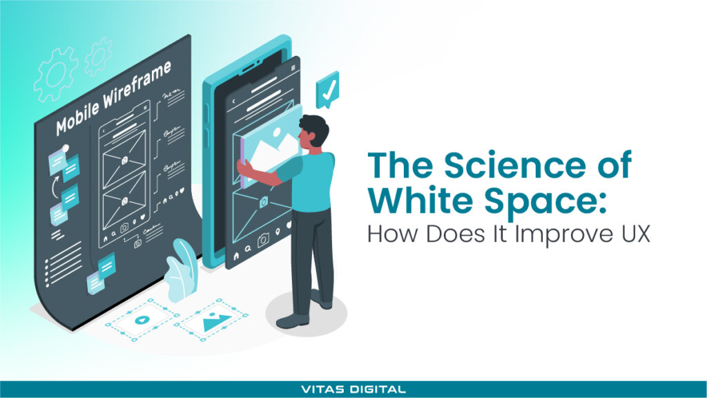
White space can trigger heated debates between designers and their clients. It's the empty area around text, images, buttons, and menus.
- Designers see it as essential for clarity, elegance, and better conversions.
- Clients often see it as wasted space that should be filled.
Who's right? Consider Apple or Google. You open it, and instantly feel at ease. Everything feels balanced, inviting you to keep scrolling. That comfort? It's white space at work.
Thus, here's exactly how proper layout enhances user experience (UX), backed by practical examples from brands that do it right.
What Is White Space in Design?
White space, also known as negative space, is the empty area between and around design elements on a webpage or digital interface. Although often misunderstood as "unused" space, it's actually a critical and intentional component of good design.
Its main goals are to:
- Improve visual clarity and readability.
- Guide user attention to key content
- Reduce cognitive overload by providing breathing room.
Here's a clear example of how white space shapes mobile usability:
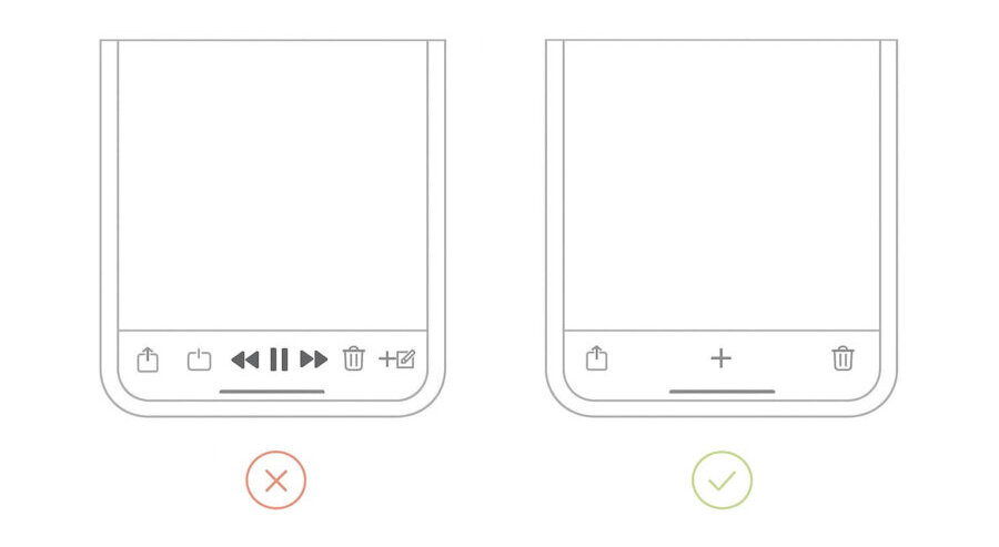
This layout isn't random. It's designed this way so your eyes don't panic—and your fingers don't miss the button.
4 Types of White Space
Before we move on to the science of white space, you need to understand its categories clearly:
- Macro space refers to the larger, empty area surrounding key content blocks. It separates sections clearly, making your design breathable.
- Micro white space refers to the smaller gaps between letters, lines, paragraphs, buttons, and form fields. It directly affects readability, similar to Slack's interface, with clearly spaced buttons and text.
- Passive white space occurs naturally between design elements, like margins or padding.
- Active space is used to guide user attention and improve the overall visual flow.
The Science of White Space
Whitespace is like air: it is necessary for design to breathe.
When a page feels crowded, users tend not to explore—they bounce. Our brains crave order, and clutter brings confusion. But it doesn't just make content easier to read—it makes it feel premium.
Brands like Tesla use spacious layouts to signal confidence. No noise, no fluff—just value, clearly presented.
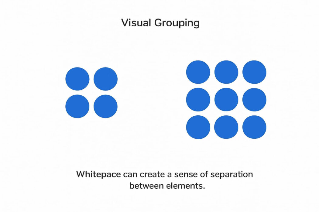
Also, according to Gestalt psychology, white space helps users make sense of a layout by:
Proximity – Grouping related elements together
Figure-ground – Separating content from background
Closure – Helping the brain "fill in" missing parts naturally
Therefore, good spacing shapes how users see, think, and feel on your site.
Why White Space Matters in UI/UX Design
When layouts are overcrowded, users feel lost, distracted, and overwhelmed. Good white space makes content scannable, improves accessibility across devices, and reduces cognitive overload. It's about making them usable, memorable, and effective.
Creates Modern & Clean Design
Too much stuff on a screen? It's overwhelming. When everything fights for attention, people lose focus fast. Instead of reading or clicking, they want to leave.
That's where white space comes in. It gives the page some breathing room. Your eyes relax, your brain doesn't have to work as hard, and everything feels easier to take in.
"Simplicity is the ultimate sophistication."
Good use of white space makes a site look fresh and modern. Clean. Professional. You're not cramming info into every corner—you're letting it flow. Buttons, text, images—each one has space to stand out and do its job.
And more than anything, it just feels better. The layout becomes calmer, and the user experience improves. It's the difference between walking into a well-designed store and one that's packed wall to wall.
When you get the spacing right, your website doesn't just look nice—it feels premium. And that makes people trust it more, stay longer, and take action.
Improves Website Scannability
Space brings focus—and focus leads to action. Actually, a scannable layout with smart spacing can improve website usability by up to 124%
It visually separates content without relying on lines or borders. That makes it easier for people to spot what's important—whether it's a headline, a call-to-action, or just a piece of helpful info.
Spacing also affects how we read. When text feels cramped, people tend to skip it. But add room between lines, around buttons, or between sections, and suddenly everything feels clearer and easier to absorb.
This side-by-side example shows how proper line spacing and margins improve readability:
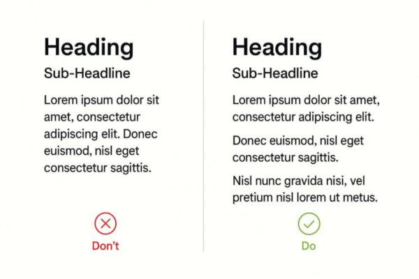
The left block feels crowded and harder to follow, while the proper layout makes the text easier to scan and less tiring to read.
And it doesn't stop there. According to Hick's Law, fewer choices = faster decisions. By removing clutter, you reduce distractions and make actions feel more obvious. Instead of showing users five things at once, good spacing naturally highlights just one or two.
Guides the User's Attention
This is a tool for directing focus.
- How? When there's enough space around key elements, like buttons or messages, users are more likely to notice a call-to-action.
- Why? There is no other content, and CTAs naturally stand out.
This helps shape a clear visual hierarchy. Important sections catch the eye first, while supporting content stays in the background. That makes pages easier to scan—and easier to use.
Notice Google's homepage simplicity? That's not an accident. The search bar stands out because it's surrounded by space. There's nothing else to pull attention away.
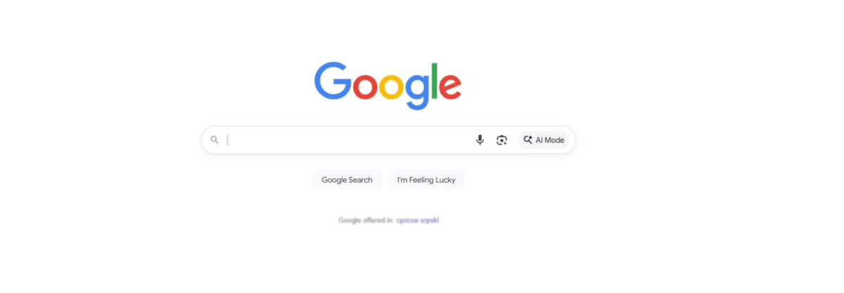
Source: Google
Designers often use this same method in longer forms or landing pages. By adding space between grouped content—like contact fields or product features—each part feels easier to understand.

White space also clarifies relationships between objects. It shows which elements belong together and which don't. This is how users can tell what's important at a glance—without needing to think twice.
The result? Less distraction, easier navigation, and a better overall experience.
Improves Mobile Experience
Mobile screens leave little room for error. That's why white space isn't just helpful—it's essential.
Without enough space, users end up zooming in, misclicking buttons, or skipping content entirely. And when that happens, they bounce.
Here's what white space fixes:
- Tappable buttons become easier to use
- Text becomes more readable.
- Content sections stand apart, guiding the scroll.
It also supports responsive design. With consistent spacing, your layout adjusts smoothly across all devices—keeping your website clean, functional, and easy to navigate, regardless of screen size.
Increases Conversion Rates
Crowded designs kill conversions, especially when it comes to your call-to-action (CTA).
If your CTA is surrounded by distractions—such as text, images, or buttons—it can get lost. Users don't know where to click, so they don't.
The fix? Use white space to isolate your CTA. The more breathing room it has, the more it stands out.
Sometimes conversion rates increased by over 200%—just by decluttering the area around the button! So instead of making your CTA louder, make the space around it quieter. Let's focus on the work.
How to Use White Space Effectively
Random gaps won't improve user experience, but strategic spacing will. To achieve that balance on product and landing pages, teams often rely on graphic design services to establish spacing systems that scale across breakpoints.
Here's how our design team uses it effectively across layouts, buttons, and various screen sizes.
Stay Consistent With Your Space
More generous white space often signals minimalism, elegance, or luxury (think high-end brands). On the other hand, tighter layouts—like those on news sites—tend to feel more information-rich and utility-focused.
But whatever your style, consistency matters most. If some sections feel airy and others feel cramped, users may become visually disoriented or overwhelmed.
How to stay consistent:
- Stick to a spacing system (8pt or 10pt grids work well)
- Use the same margins and padding across similar elements.
- Align your content within a clear grid to avoid awkward gaps and ensure a cohesive appearance.
- Maintain proportional white space on both desktop and mobile devices.
This doesn't mean all spacing must be identical—just intentional. Ensure your layout feels balanced and that your spacing reinforces your visual hierarchy.
Cushion Your Call-To-Action (CTA) buttons
A strong CTA isn't just about the button itself—it's about how clearly it stands out on the page.
- White space draws the eye without using flashy design tricks.
- It reduces decision fatigue by keeping the focus on one action.
- Clean spacing increases click-through rates.
Best practices:
- Keep a generous margin around your CTA (not crammed between text)
- Don't stack too many elements near the button.
- Use contrast (like color) to make the CTA pop, then let white space carry the rest.
Users are more likely to click when they know where to click—and when the design doesn't compete for their attention.
Adapt Graphic Design Elements For All Devices
Good white space on the desktop doesn't always translate well to mobile, and vice versa. What looks clear on a large screen might feel cramped or chaotic on a phone.
What to pay attention to:
- Line spacing: On smaller screens, tight line spacing makes text hard to read
- Margins & padding: Buttons and images need more spacing on touch devices for easier interaction
- Breakpoints: Adjust white space settings in your CSS based on common device widths
- Font scaling: Responsive typography ensures your text and spacing stay proportional
Think mobile-first, but test across devices. The best designs feel intuitive and uncluttered, no matter how users view them.
Brands Using White Space Effectively
These brands prove that spacing isn't just a design detail—it's a strategic choice that supports clarity, usability, and brand perception.
- Apple keeps things minimal for a reason. Every product receives its own spotlight, featuring clean visuals and just enough text, so visitors instantly know what they're looking at—without distractions.
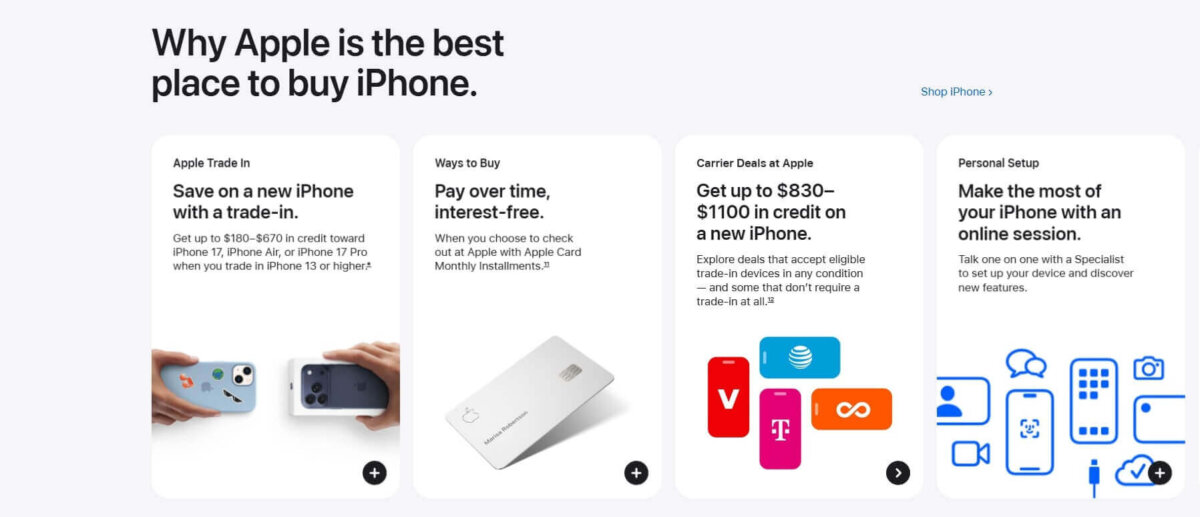
Source: Apple
- Slack makes work feel less chaotic at first glance, as seen on the homepage. White space separates key messages and calls to action, making the experience feel simple, clear, and actionable.

Source: Slack
- Wealthsimple makes finance less intimidating. With clean layouts and full-screen sections, they guide your eye through the story without pressure—just focus and flow.

Source: Wealthsimple
- Lamborghini lets the product speak. Instead of stuffing the page with content, they give every car model a clean stage to shine—making the experience feel bold and luxurious.
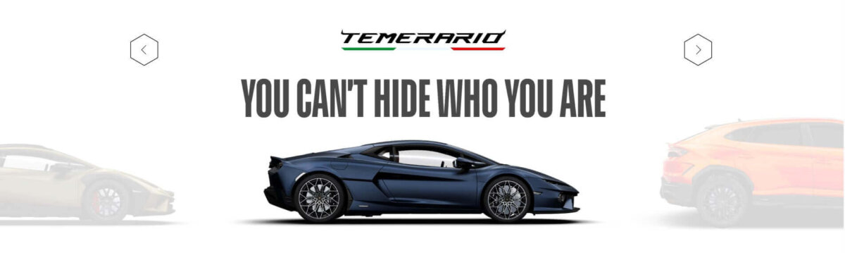
Source: Lamborghini
Ready to Stop Treating Empty Space as Wasted Space?
White space transforms clutter into clarity, turning design into a tool that builds trust, guides attention, improves usability, and drives measurable conversions.
Yet most brands still treat every pixel as something to fill, creating noise that overwhelms users and quietly kills performance. If you're ready to make that change, contact us, and let's put space to work for your business.