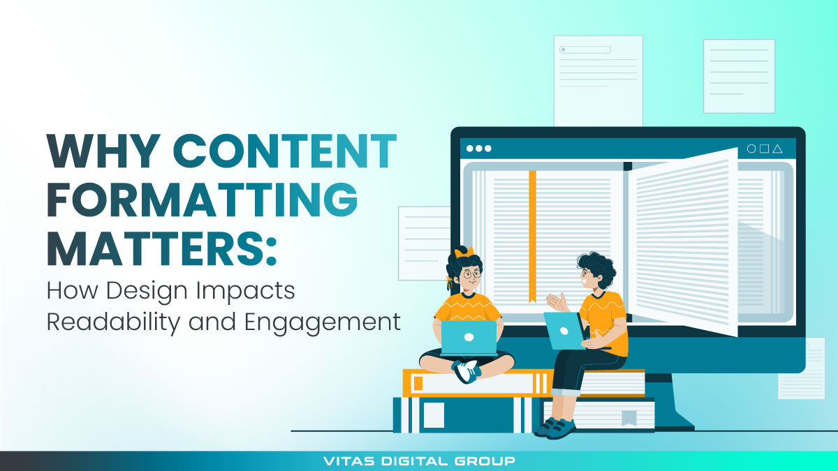
Typography is the visual side of your written content; it's how your text looks, feels, and guides the reader's attention. It includes everything from font choice and line spacing to how words are placed on a page or screen.
You see it everywhere:
- on websites
- social media posts
- ads
- packaging
Good typography helps people read comfortably, understand your message faster, and recognize your brand even before seeing your logo.
We'll cover all about typography in graphic design; why it's so important for engagement and brand perception, the main types of typography you can use, and how to choose fonts that make your content easy to read and memorable.
Why Is Typography Important in Graphic Design?
Typography shapes how people see, read, and feel your message. It’s the structure behind every word — from the font you pick to how text is spaced and aligned on the screen.
Good typography does more than look nice — it helps people navigate your content naturally.
Here’s what makes it so important in graphic design:
- Improves readability: Clear fonts and balanced spacing make content easy to follow.
- Creates hierarchy: Size and weight guide the reader’s eye through headlines, subheadings, and body text.
- Builds trust: A clean, consistent font choice instantly makes your brand feel more reliable and professional.
- Sets the mood: Fonts have personality — some feel modern and bold, others classic or playful.
Many brands invest in photos and visuals but overlook typography, even though it’s just as critical for brand perception.
According to Gestalt Psychology, people process words as complete shapes, not letter by letter. That’s why font style directly affects how your audience feels about your message — whether it comes across as confident, friendly, elegant, or serious.
The Influence of Typography in Content Marketing
Typography plays a silent but central role in shaping how readers engage with your content. It improves legibility, enhances brand perception, and supports the storytelling flow.
Marketers who understand why typography is important in graphic design use it strategically to boost engagement and conversions. Fonts can make readers feel calm, excited, or motivated — and those emotional cues can affect decisions.
This connection between design and communication explains why many companies partner with experts to align visuals with voice. Working with a professional graphic design service ensures that your typography, layout, and color scheme complement your brand message rather than compete with it.
A cohesive type system helps your content stand out while staying consistent across all channels — from your website to paid ads and social campaigns.
4 Principles of Effective Typography
1. Readability and Legibility
2. Minimalism and Simplicity
3. Consistency Across Branding
4. Contrast and Hierarchy
Good typography in content design creates hierarchy — bold headlines, balanced subheadings, and readable body text. Contrast in weight and size directs the reader’s eye and helps prioritize information naturally.
Choosing the Right Typography for Your Brand
Typography should mirror your brand's personality and values. Some businesses rely on classic serif fonts that suggest authority, while others choose modern sans-serif fonts that emphasize innovation and clarity.
Here are a few types of typography in graphic design and how they shape perception:
- Serif Fonts: Traditional and credible (e.g., Times New Roman, Baskerville).

- Sans-Serif Fonts: Clean and modern (e.g., Helvetica, Calibri).

- Script Fonts: Elegant and expressive, ideal for luxury and fashion brands.

- Display Fonts: Bold and creative, perfect for headlines or logos.

For example, Google’s use of geometric sans-serif typography communicates simplicity and innovation, while The Wall Street Journal’s serif font conveys trust and authority. These are perfect examples of typography in graphic design done right.
Pairing fonts strategically is another crucial skill. A serif font for headings combined with a sans-serif font for body text creates contrast and balance, keeping the layout engaging yet professional.
Ready to Redefine Your Brand Through Typography?
Strong typography turns simple visuals into a clear, recognizable identity. If your brand needs fonts and layouts that speak with purpose, contact our team and let's craft a visual style that feels consistent, readable, and uniquely yours.