When users land on your website, they form an opinion in as little as 0.05 seconds! That allows you and your graphic design team to leave a great impression right off the bat, and the purpose of this blog is to go into detail about how to achieve that.
So, knowing how to choose images for social media posts and your website is critical. We're going to discuss why visual design matters, what elements to focus on, and how to create stunning visuals that perform across platforms.
Table of contents
- Why Visual Design Matters for Your Website and Social Media
- Key Elements of Website Visual Design
- Choosing the Right Images for Your Website
- Visuals for Social Media: What Works and Why
- Web & Graphics: How to Make Them Work Together
- Best Practices for Creating Visually Stunning Websites
- Tools for Image Editing and Design
- Common Visual Design Mistakes to Avoid
- Ready to Make Your Visuals Work Harder?
- Browse by Topic
- Share
- Newest Posts
Why Visual Design Matters for Your Website and Social Media
Visuals are your brand's first handshake with your audience. They set expectations, trigger emotions, and influence whether visitors stay or leave. For business website images, this first impression forms in milliseconds.
If your site looks outdated, cluttered, or inconsistent, users might:
- Bounce before they even begin to explore what you offer,
- Discredit you as a source of information,
- Choose to work with a competitor that appears more attractive (even if their product isn't).
Posts with good photo content receive 2.3 times more engagement than text-only updates. And when you add videos, reels, or motion graphics, engagement often skyrockets.
Strong website images also build trust and encourage conversions. A professional layout with a clear hierarchy feels reliable, encouraging users to sign up, make a purchase, or share content.
Key Elements of Website Visual Design
Every visual decision – from layout to color palette to font choice – affects how users experience your brand. In this section, we're going to discuss each of these elements and how to use them to your advantage.
Here's what to pay attention to:
Layout and Structure
Your layout is the blueprint for your user's journey. A clean, organized layout helps visitors find what they're looking for quickly and intuitively. On the other hand, a cluttered or inconsistent layout can cause frustration and confusion, prompting users to switch to a competitor's site.
Here's what that includes:
- Consistency in layout – to build familiarity and make a site easier to navigate.
- A clear visual hierarchy – like large headlines, medium subheads, and smaller body text – makes sure that your content is digestible,
- White space – to help guide the eye and keep the interface feeling open and breathable.

Color Palette for Website
Color psychology matters. Blue signals trust, red creates urgency, and green feels natural. The right palette ensures harmony across your website images and social media visuals.
For example, blue often conveys trust and stability, making it a popular choice for finance or tech brands. Red can signal urgency or excitement, while green evokes a sense of calmness and naturalness.

The key is to select a palette that aligns with your brand's voice and message. Sticking to a consistent set of primary and accent colors creates visual harmony and helps users recognize your brand across different pages and platforms.
Minimal palettes, such as black, white, and gray, can convey a modern and sophisticated feel. In contrast, bold color combinations can signal creativity and energy. Regardless of the direction you take, the colors you choose should support, rather than compete with, your content.
Typography and Readability
A poor choice in font can increase the user's eye strain, leaving a negative impression, which we want to avoid. The right typography helps communicate your brand's personality while making your content easy to read, but readability should be your top priority.
Here's what that means:
- Font sizes should be large enough to read comfortably,
- Make sure there's enough line spacing so it doesn't look cluttered,
- Pay attention to the contrast against the background.
Pairing fonts thoughtfully, one for headlines and one for body copy, keeps your site visually interesting without overwhelming the user. Still, they should align with your branding.

Choosing the Right Images for Your Website
It doesn't matter if you're uploading photos you took or using stock images – these tips apply to both approaches. We covered how to select and prepare pictures that reflect your brand identity, load efficiently, and maintain consistency across your website.
Tip 1: Match Images to Your Brand Identity
Think about your brand's personality. If your brand is youthful and bold, use dynamic visuals with bright colors and a sense of movement. For a refined and elegant brand, opt for clean, minimalist images with subtle tones.
Tip 2: Optimize for Performance
Large image files can slow down your website, particularly on mobile devices. Always compress your images before uploading, and opt for modern formats like WebP for faster loading without compromising quality.
Tip 3: Stay Consistent Across All Pages
Filters, tones, and composition should align across all business website images for a unified user experience.
Visuals for Social Media: What Works and Why
Each platform has its own rules. A good photo on Instagram thrives on aesthetics, while LinkedIn favors clean infographics and clear graphics. Adapting visuals per channel boosts engagement.
- On Instagram, the focus is on aesthetic appeal. Grid layouts, color-coordinated posts, and motion-heavy reels perform well.

- On LinkedIn, users value clarity and substance – think branded infographics, clean quote graphics, and industry-relevant visuals.

It's essential to tailor your visuals to match the format and tone of each platform. Use the correct aspect ratios, ensure your text is legible (especially on mobile devices), and don't forget to incorporate motion.
And as always, accessibility matters. Here's what you can do:
- Add alt text to visuals,
- Use clear contrasts,
- Ensure your graphics are clear and easy to understand at a glance.
Knowing how to choose images for social media posts means tailoring visuals to platform tone, size, and audience behavior. Not sure how to stay consistent through all channels? Graphic design services for websites and social media provide the structure necessary to maintain the brand's identity.
Web & Graphics: How to Make Them Work Together
Great visual design it's about how all the pieces work together. Photos, icons, illustrations, animations, and UI elements all contribute to the overall experience.
But, before considering aesthetics, consider how visual elements guide the user's attention and organize the content. Every part of the layout (photos, icons, illustrations, animations, and UI components) should serve a clear functional purpose.
- Use graphic elements like lines, shapes, and icons to create hierarchy.
- Break up content, and direct focus.
- Custom illustrations can add uniqueness and tone, and photography brings realism and emotional depth.
The key is to use each element deliberately to support the user journey.
Best Practices for Creating Visually Stunning Websites
First, compress and lazy-load large website images before publishing. Don't forget to use accessibility practices such as alt text and high contrast and maintain consistent branding across web and social platforms.
Prioritize Page Speed
Ideally, the page speed should be under 3 seconds. Anything over that and you risk higher bounce rates, lower search rankings, and lost conversions.
Large visuals may look impressive, but they can slow download times, which can frustrate users and negatively impact SEO. Compress your images and utilize tools like lazy loading to keep your content snappy.
Free tools like TinyPNG and ShortPixel can be extremely helpful!

Keep Accessibility in Mind
Ensure that you use sufficient color contrast between the text and the background. Always include alt text for screen readers. Avoid relying solely on visuals to convey important information, especially for CTAs or navigation cues.
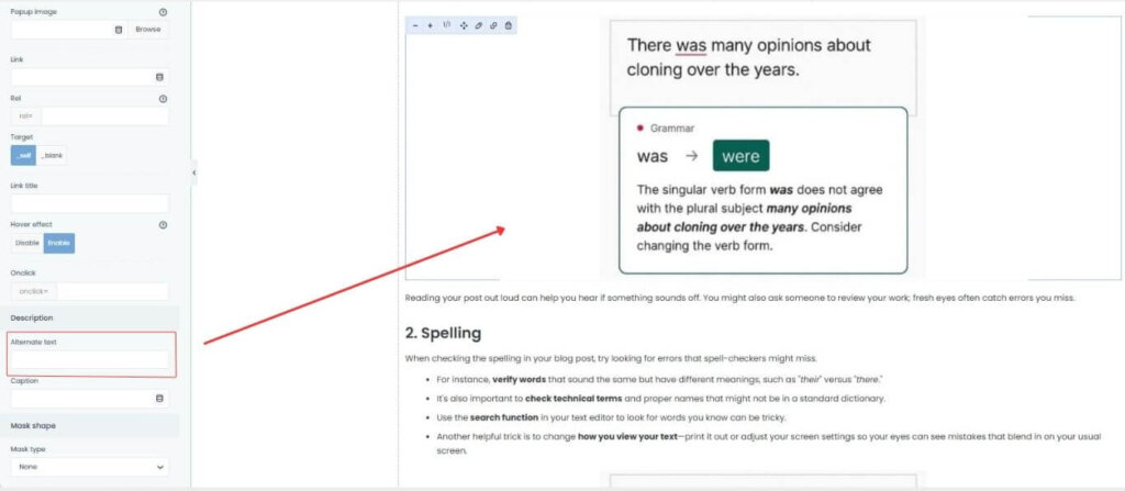
This isn't just about SEO, though. You need to keep in mind that some users of your website might be people with visual impairments or other disabilities. Therefore, making your site accessible to everyone should be a priority.
Make Everything Consistent
Fonts, colors, icons, and image styles should all feel cohesive and consistent, as if they belong to the same brand.
This consistency creates trust, helps with recognition, and makes your digital presence feel unified, from your homepage to your latest Instagram reel. An easy way to do this is by having a brand book – one document that stores all the necessary information.
This should include the exact HEX codes for every color your brand uses, fonts (and where to find them), and any other elements that a designer might need.
Tools for Image Editing and Design
You don't need to be a professional designer to create great visuals – you just need the right tools. Whether you're starting from scratch or refining existing assets, these platforms can help:
- Canva – user-friendly and perfect for creating quick social media graphics and templates
- Figma and Adobe – best for designing websites, apps, and interactive prototypes
- Adobe Photoshop – the industry standard for advanced image editing.
To create a consistent color palette, consider using tools like Coolors, Adobe Color, or Khroma, which generate on-brand color combinations and help maintain visual harmony.
When it comes to imagery, use high-quality stock photos from platforms like Unsplash, Pexels, or Shutterstock. But use them wisely – choose photos that feel real, relevant, and consistent with your overall aesthetic.
Common Visual Design Mistakes to Avoid
Even the best brands make visual missteps. One of the most common errors is overloading pages with large, high-resolution images, which can slow down performance. A slow site is a deal-breaker for both users and search engines.
Whitespace matters, too. Without it, you risk making the entire website feel messy and cluttered, which impacts UX and accessibility.

Inconsistent branding is another pitfall. Using a mix of colors, fonts, and image styles across different pages or platforms can weaken your message and make your brand feel disjointed.
Adhere to a well-defined style guide and review it regularly. Avoid using irrelevant or low-quality graphics that do not enhance the content. Every image should have a purpose.
And don't forget the technical side – SEO best practices, such as descriptive file names and alt text, ensure that your visuals work hard behind the scenes as well.
Ready to Make Your Visuals Work Harder?
Choosing the right visuals starts with clarity about your brand's identity. Every design decision should reflect your voice, boost usability, and create a consistent presence across all your platforms.
If you need help bringing your vision to life, our graphic design services can help bring it to life. Contact us for a free consultation.